Customers ask us for p99 (99th percentile) of metrics pretty frequently.
We plan to add such a feature to Database Performance Monitor (DPM)(more on that later). But a lot of the time, when customers make this request, they have something very specific, and different, in mind. They’re not asking for the 99th percentile of a metric, they’re asking for a metric of 99th percentile. This is very common in systems like Graphite, and it doesn’t achieve what people sometimes think it does. This blog post explains how percentiles might trick you, the degree of the mistake or problem (it depends), and what you can do if percentile metrics aren't right for you.
Away From Averages
Over the last few years, a lot of people have started talking about the problems with averages in monitoring. It’s good this topic is in wider discussion now, because for a long time averages were accepted without much deeper inspection.
Averages can be unhelpful when it comes to monitoring. If you’re merely looking at averages, you’re potentially missing the outliers, which might matter a lot more. There are two issues with averages in the presence of outliers:
- Averages hide the outliers, so you can’t see them.
- Outliers skew averages, so in a system with outliers, the average doesn’t represent typical behavior.
So when you average the metrics from a system with erratic behavior, you get the worst of both worlds: you see neither the typical behavior, nor the unusual behavior. Most systems have tons of outlying data points, by the way.
Looking at the extremes in the "long tail" is important because it shows you how bad things can sometimes get, and you’ll miss this if you rely on averages. As Amazon’s Werner Vogels said in an AWS re:Invent keynote, the only thing an average tells you is half of your customers are having a worse experience. (While this comment is totally correct in spirit, it isn’t exactly right in practice: specifically, the median, or 50th percentile, provides this property.)
Optimizely did a write-up in this blog post from a couple years ago. It illustrates beautifully why averages can backfire:
“While the average might be easy to understand it’s also extremely misleading. Why? Because looking at your average response time is like measuring the average temperature of a hospital. What you really care about is a patient’s temperature, and in particular, the patients who need the most help.”Brendan Gregg also puts it well:
“As a statistic, averages (including the arithmetic mean) have many practical uses. Properly understanding a distribution isn't one of them.”
And Towards Percentiles
Percentiles (more broadly, quantiles) are often praised as a potential way to bypass this fundamental issue with averages. The idea of the 99th percentile is to take a population of data (say, a collection of measurements from a system) and sort them, then discard the worst 1% and look at the largest remaining value. The resulting value has two important properties:
- It’s the largest value that occurs 99% of the time. If it’s a webpage load time, for example, it represents the worst experience 99% of your visitors have.
- It's robust in the face of truly extreme outliers, which come from all sorts of causes including measurement errors.
Of course, you don’t have to choose exactly 99%. Common alternate choices are 90th, 95th, and 99.9th (or even more nines) percentiles.
At this point, people assume: "averages are bad, and percentiles are great" — let’s calculate percentile metrics and put them into our time series databases, right? Not so fast.
How Time Series Databases Store and Transform Metrics
There’s a big problem with most time series data and percentiles. Time series databases are almost always storing aggregate metrics over time ranges, not the full population of events originally measured. Time series databases then average these metrics over time in a number of ways. Most importantly:
- They average the data whenever you request it at a time resolution that differs from the stored resolution. If you want to render a chart of a metric over a day at 600px wide, each pixel will represent 144 seconds of data. This averaging is implicit and isn’t disclosed to the user. They ought to put a warning on that!
- They average the data when they archive it for long-term storage at a lower resolution, which almost all time series databases do.
And therein lies the issue. You’re still dealing with averages in some form. And averaging percentiles doesn’t work, because to compute a percentile, you need the original population of events. The math is just broken. An average of a percentile is meaningless. (The consequences vary. I’ll return to that point later.)
A lot of monitoring software encourages the use of stored and resampled percentile metrics. StatsD, for example, lets you calculate metrics about a desired percentile, and will then generate metrics with names such as foo.upper_99 and emit those at intervals to be stored in Graphite. All well and good, if the time resolution you want to look at is never resampled, but we know this doesn’t happen.
The confusion over how these calculations work is widespread. Reading through the related comments on this StatsD GitHub issue should illustrate this nicely. Some of these folks are saying things that just ain’t so.
Perhaps the most succinct way to state the problem is this: Percentiles are computed from a population of data, and have to be recalculated every time the population (time interval) changes. Time series databases with traditional metrics don’t have the original population.
Alternative Ways To Compute Percentiles
If a percentile requires the population of original events—such as measurements of every web page load—we have a big problem. A Big Data problem, to be exact. Percentiles are notoriously expensive to compute because of this.
Lots of ways to compute approximate percentiles are almost as good as keeping the entire population and querying and sorting it. You can find tons of academic research on a variety of techniques, including:
- Histograms, which partition the population into ranges or bins, and then count how many fall into various ranges.
- Approximate streaming data structures and algorithms (sketches).
- Databases sampling from populations to give fast approximate answers.
- Solutions bounded in time, space, or both.
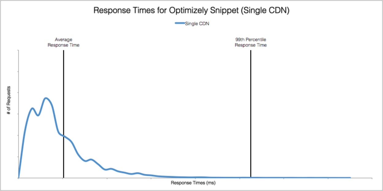
The gist of most of these solutions is to approximate the distribution of the population in some way. From the distribution, you can compute at least the approximate percentiles, as well as other interesting things. From the Optimizely blog post, again, there’s a nice example of a distribution of response times and the average and 99th percentile:

There are tons of ways to compute and store approximate distributions, but histograms are popular because of their relative simplicity. Some monitoring solutions actually support histograms. Circonus is one, for example. Circonus CEO Theo Schlossnagle often writes about the benefits of histograms.
Ultimately, having the distribution of the original population isn’t just useful for computing a percentile, it’s very revealing in ways the percentile isn’t. After all, a percentile is a single number trying to represent a lot of information. I wouldn’t go as far as Theo did when he tweeted “99th percentile is as bad as an average,” because I agree with percentile fans that it’s more representative of some important characteristics of the underlying population than an average is. But it’s not as representative as histograms, which are much more granular. The chart above from Optimizely contains way more information than any single number could ever show.
Percentiles Done Better in Time Series Databases
A better way to compute percentiles with a time series database is to collect banded metrics. I mention the assumption because lots of time series databases are just ordered, timestamped collections of named values, without the capability of storing histograms.
Banded metrics provide a way to get the same effect as a series of histograms over time. What you’d do is select limits that divide the space of values up into ranges or bands, and then compute and store metrics about each band over time. The metric will be just as it is in histograms: the count of observations that fall into the range.
Choosing the ranges well is a hard problem, generally. Common solutions include logarithmic ranges and ranges providing a given number of significant digits but may be faster to calculate at the cost of not growing uniformly. Even divisions are rarely a good choice. For more on these topics, please read Brendan Gregg’s excellent write-up.
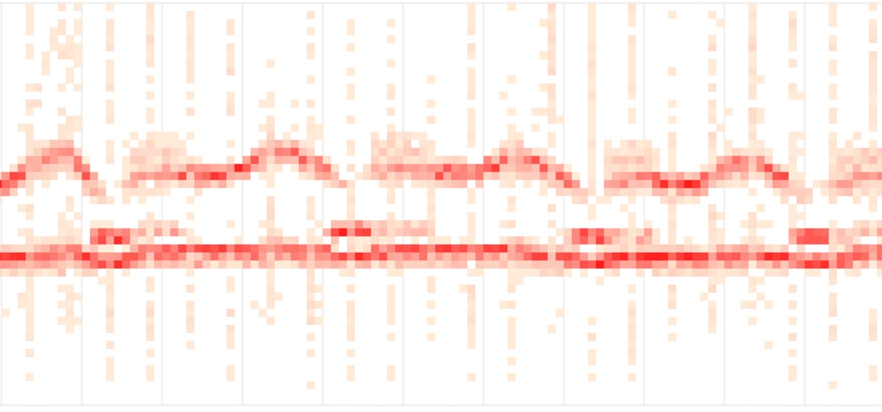
The fundamental tension is between the amount of data retained and the fineness of the resolution. However, even coarse banding can be effective for showing more than simple averages. For example, Phusion Passenger Union Station shows banded metrics of request latencies using 11 bands. (I don’t think the visualization is the most effective; the y-axis’s meaning is confusing and it’s essentially a 3d chart mapped into 2d in a nonlinear way. Nevertheless, it still shows more detail than an average would reveal.)

How would you do this with popular open source time series tools? You’d have to define ranges and create stacked charts as shown.
To compute a percentile from this would be much more difficult. You’d have to range over the bands in reverse order, from biggest to smallest, summing up as you go. When you reach a sum no more than 1% of the total, that band contains the 99th percentile. There are lots of nuances in this—strict inequalities, how to handle edge cases, what value to use for the percentile (upper or lower bin limit? in the middle? weighted?).
And the math can be confusing. You might think, for example, you need at least 100 bands to compute the 99th percentile, but it depends. If you have two bands and the uppermost band’s value contains 1% of the values, you’ve got your 99th percentile. (If that sounds counterintuitive, take a moment to ponder quantiles; I think a deep understanding of quantiles is worthwhile.)
So this is complicated. It’s possible in the abstract, but it also largely depends on a whether a database’s query language supports the calculations you’d need to get an approximate percentile. If you can confirm systems in which this is definitely possible, please comment and let me know.
The nice thing about banded metrics in a system like Graphite, which treats all of its metrics naively in terms of assuming they can be averaged and resampled at will, is banded metrics are robust to this type of transformation. You’ll get correct answers because the calculations are commutative over all time ranges.Beyond Percentiles: Heatmaps
A percentile is still a single number, just like an average. An average shows the center of gravity of a population, if you will; a percentile shows a high-water mark for a given portion of the population. Think of percentiles as wave marks on a beach. But although this reveals the boundaries of the population and not just its central tendency as an average does, it’s still not as revealing or descriptive as a distribution, which shows the shape of the entire population.
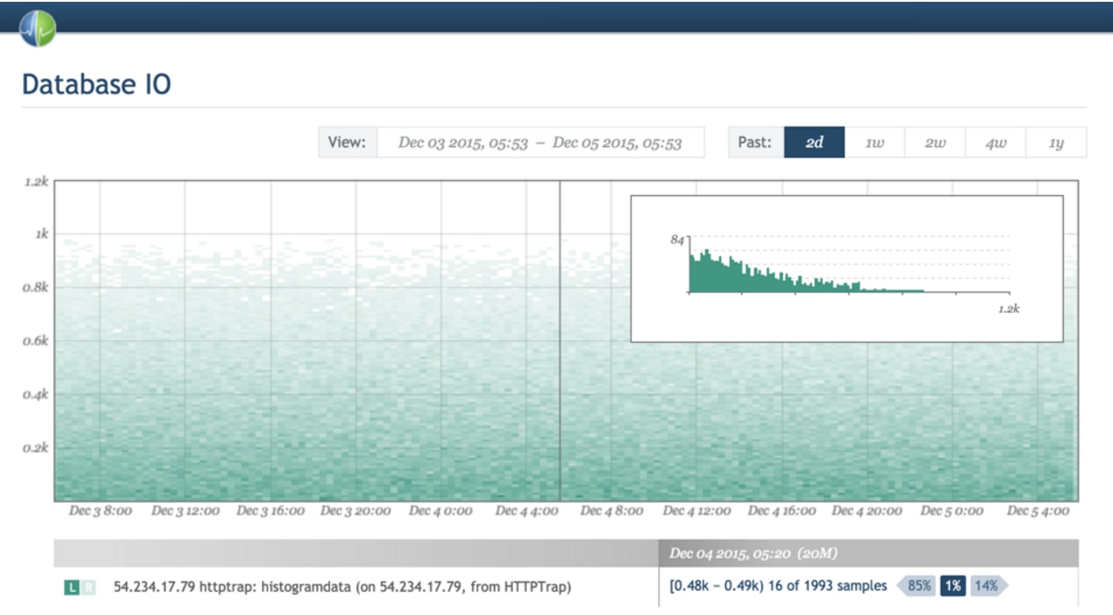
Enter heatmaps, which are essentially 3-D charts where histograms are turned sideways and stacked together, collected over time, and visualized with the darkness of a color. Again, Circonus provides an excellent example of heatmap visualizations.

On the other hand, as far as I know, Graphite doesn'tt have the ability to produce heatmaps with banded metrics. If I’m wrong and it can be done with a clever trick, please let me know.
Heatmaps are great for visualizing the shape and density of latencies, in particular. Another example of heatmap latency is Fastly’s streaming dashboard.

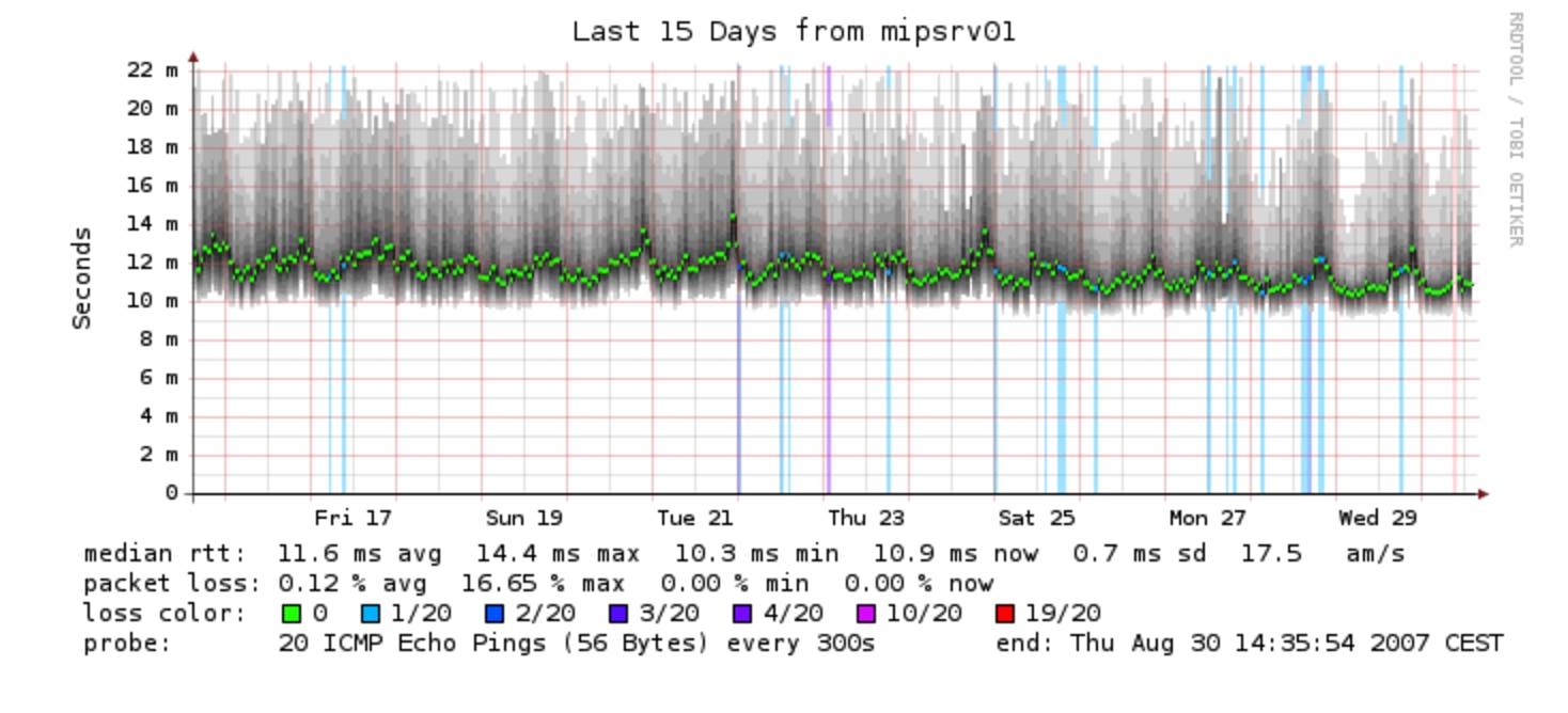
Even some old-fashioned tools you might think of as primitive can produce heatmaps. Smokeping, for example, uses shading to show the range of values. The bright green is the average:

How Bad Is It To Store Metrics Of Percentiles?
OK, so after all this complexity and nuance, perhaps the good old StatsD upper_99 metrics of percentiles aren’t sounding so bad anymore. After all, they’re pretty simple and efficient, and it’s a turnkey solution. How bad are they, really?
It depends. For lots of purposes they’re absolutely fine. I mean, you still have the limitations that percentiles aren’t very descriptive by themselves. But if you’re OK with that, then the biggest issue remaining is how they get mangled by resampling, which basically means you’re looking at wrong data.
But all measurements are wrong anyway, and besides, lots of wrong things are useful regardless. For example, I’d say half of the metrics people use in monitoring systems are already deliberately transformed in ways that mangle them. Load average, for example. It’s very useful, but when you realize how the sausage is made, you might be a little shocked at first. Similarly, lots and lots of widely available systems report partially digested metrics about their performance. A bunch of Cassandra’s metrics are outputs from Coda Hale’s Metrics library, and are time-decayed averages (exponentially weighted moving averages), which some people have a huge aversion to.
But back to metrics of percentiles. If you store a p99 metric and then zoom out and view an averaged version over a long time range, although it won’t be “right,” and may be quite different from the actual 99th percentile, the ways in which it's wrong won’t necessarily render it unusable for the desired purpose, i.e., understanding the worst experience most of your users are having with your application. Regardless of their exact values and how wrong they are, percentile metrics tend to a) show outlying behavior and b) get bigger when outlying behavior gets badder. Super useful.
So it depends. If you know how percentiles work and averaging a percentile is wrong, and you’re OK with it, it might still be useful to store metrics of percentiles. But you're introducing a sort of moral hazard: you might deeply confuse people (perhaps your colleagues) who don’t understand what you’ve done. Just look at the comments on that StatsD issue again; the confusion is palpable.
If you’ll permit me to make a bad analogy, I’ll sometimes eat and drink things in my fridge I’d never give to someone else. (Just ask my wife.) If you give people a bottle labeled “alcohol” and it contains methanol, some of them will drink it and go blind. Others will ask “what kind of alcohol is in this bottle?” You need to bear that responsibility.
What Does DPM Do?
At time of writing, our time series database doesn’t support histograms, and we don’t compute and store metrics of percentiles (although you can easily send us custom metrics if you want).
In the future, we plan to store banded metrics at high resolution, i.e., lots of bands. We can do this because most bands will probably be empty, and our time series database handles sparse data efficiently. This will essentially give us histograms once per second (all of our time series data is one-second granularity). We downsample our data to one-minute granularity after a configurable retention period, which is three days by default. Banded metrics will downsample into one-minute-granularity histograms without any mathematical curiosities.
And finally, from these banded metrics, we’ll be able to compute any desired percentile, indicate the estimated error of the value, show heat maps, and show distribution shapes.
This won’t be a quick project and will require lots of engineering in many systems, but the foundation is there and we designed the system to eventually support this. No promises on when we’ll get it, but I thought it’d be useful to know where our long-term thinking is.
Conclusions
This was a longer post than I thought it’d be, and I covered a lot of ground.
Hopefully this has been helpful.


