In our latest webinar, Baron Schwartz talked about how to best prepare for potential traffic spikes during Black Friday and Cyber Monday. Although some organizations may not experience a seasonal peak during the holidays, there might be other times when traffic surges can be expected--we thought we’d use the occasion of Black Friday to share some techniques to help you prepare for times when your systems may be stressed.
Even for established business with a consistent track record, capacity planning can be a challenge. It’s even more difficult for a company that didn’t exist five years ago and is now growing at breakneck speed. In the webinar and in this post we discuss two analytic techniques that can help you forecast demand and correctly gauged capacity.
Balancing Capacity and Peak Performance
Capacity planning is about understanding your ability to serve a desired workload within performance tolerances. When you push systems too hard and they stop performing acceptably you essentially have a condition in which, "
Slow is the new down." For that reason, determining the limits and conditions of peak performance is a central goal of capacity planning.
You need to anticipate the best ways to serve that capacity while maintaining good performance--consistent, fast, correct, with low failure rate, etc. The reality is that there are problems that will sometimes blindside you, and other times, it'll look like the systems will perform well, but performance then suddenly degrades, rapidly. To eliminate surprises, you first need to understand the soft and hard limits of your components and resources.
Understanding Hard and Soft Limits
Hard limits are unforgiving and non-negotiable. For example, consider disk space. When a disk is full, that’s it--the limit is quantitative and absolute. Other components and resource with hard limits include things like the maximum number of connections(max_connections) a database can handle before connection start dropping. Also, in the case of transactional databases, you need to know the size limit of the redo log you can write to before you start to circle around and the head approaches the tail. It’s important to keep in mind that redo log capacity is a hard limit, and when you start to approach that hard limit resources can start denying requests.
Soft limits, on the other hand, are a bit more forgiving. You may feel some degradation as you approach these limits, but you won’t see a steep, edge-of-the-cliff drop in performance. The redo log mentioned earlier is actually a bit of a hybrid—it has both a hard limit and a soft limit. In most systems, as you start to fill the redo log, if you aren’t keeping up with the background tasks of purge or vacuum, algorithms kick in that will start to place back pressure on the database. Other examples of soft limits include network buffers and latency under load. As you start to approach becoming fully loaded, latency starts to spike, so you see non-linear scaling effects.
How Much Runway Do You Have?
Once you have a sense of your capacity, you now need to figure out how much runway you have—how much headroom is there before the database will run out of resources? There are a variety of ways you can model and simulate in order to forecast what you’ll need to handle those peaks. You can then try to figure out your current usable capacity. A couple of forecasting methods that SoalrWinds® has found particularly useful are the Universal Scalability Law (USL) and Queuing Theory. Below are examples of each type of analysis, using real (anonymous) data from some of our customers. If you'd like to dig deeper on either topic, we've also published eBooks that can be found in the resource section of our site. You can find Practical Scalability Analysis with the Universal Scalability Law here The Essential Guide to Queueing Theory here.
The Universal Scalability Law
One of the appealing things about the USL is that it’s a black box model that doesn’t require too many detailed measurements of metrics that are difficult to get from real production systems. Instead, the necessary data is easy to get. The chart below, from a real customer system, shows the result of running such data through the USL model. In this case, it's easy to see that this particular system will not scale linearly—we see a roll-off. The dashed line that’s curving over toward the right and the scatter plot of points demonstrates this clearly.
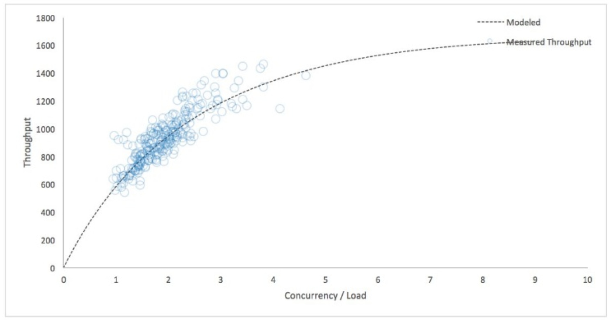 As this system gets more heavily loaded—measured by concurrency on the horizontal axis—we don’t see a linear line heading straight up off the chart. If you look closely at the curve of the line, it's indicating that we can’t exceed more than 1,200 or so queries per second on this server. This server is operating in the region of non-linearity already, and we shouldn't expect to be able to absorb twice the traffic. If we do, the system will produce long wait times, involving instances of the system timing out and even failing.
Let’s look at another example using the USL model. A customer approached us to look at some of their key systems that were only lightly loaded, but they nonetheless were open to analysis, to guarantee they weren’t missing anything. After pulling the data and plugging it into the USL, we saw the chart below. You can see by looking at the horizontal axis that the concurrency is very low.
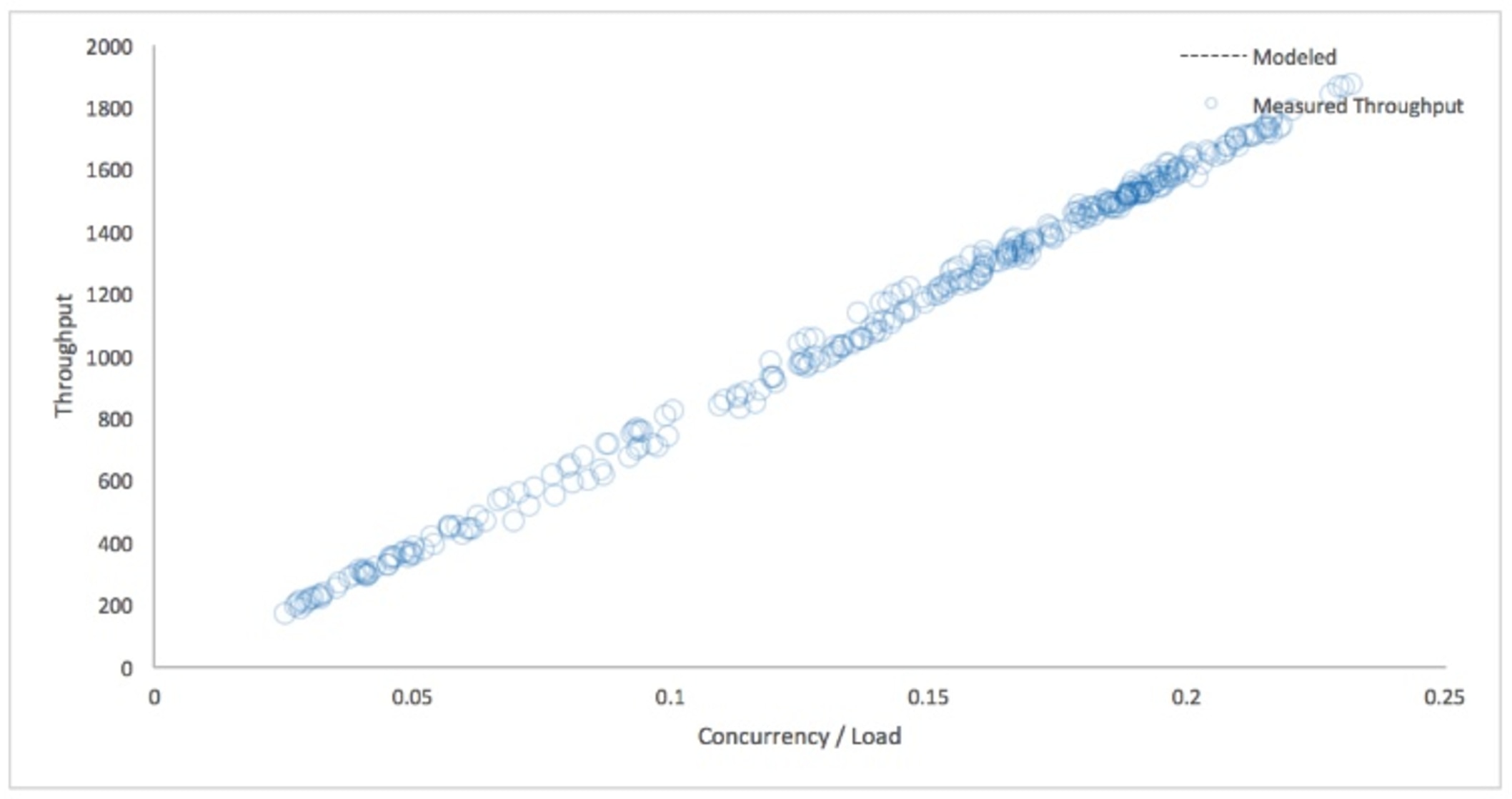 Impressively, this server is barely strained—it’s only at a fraction of utilization. It’s also showing very linear scaling, and because they're not entering any nonlinear regions, they can be confident that their systems can handle these loads effectively. That linearity is what you want to see!
Whether these results confirm assumptions, or raise new questions, by doing exercises with the USL, you create a lot of opportunity for a “dialog” with your systems, interrogating their performance to better understand the nuances.
Queuing Theory
Queueing theory is another forecasting technique that can explain how and why a system will start to degrade non-linearly at high utilization. In particular, queueing theory helps us understand how well systems perform work, as it illustrates the efficiency and rapidity at which a line of requests for work can execute. If work lines up but cannot execute, it causes issues for a system--if we can find the scenarios where those stoppages occur, we can better understand the limits that dictate those faults.
For example, as CPU and disks increase in utilization, you'll see response times go through the roof. And these changes can happen abruptly. The graph below applies the equations from queueing theory to show IO utilization versus query response data from one of our customers. Note the elbow and then suddenly... boom. The model spikes into an almost vertical line. It gets much worse very fast.
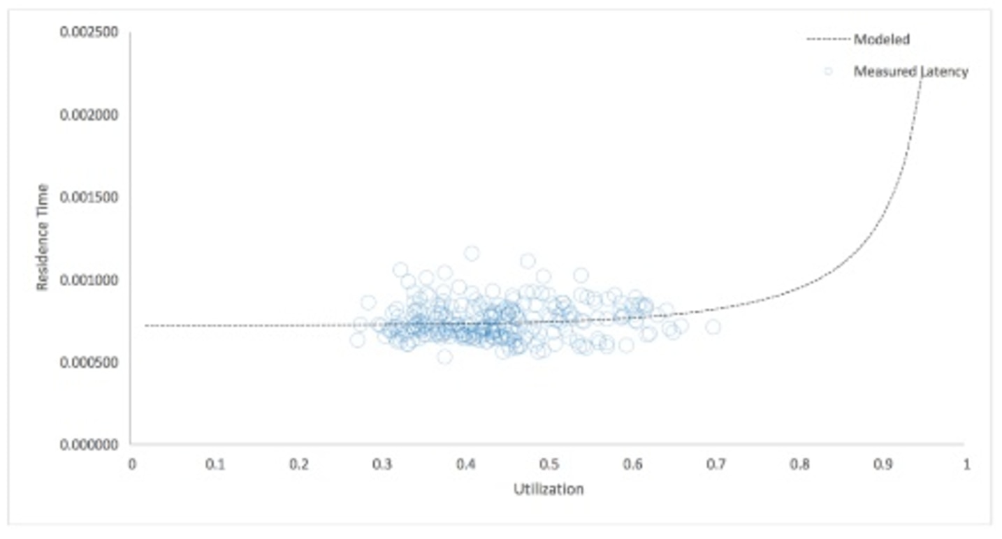 With this analysis, we're measuring response and utilization at different tiers: IO latency at the operating system and query latency at the database level using TCP sniffing with our SolarWinds® Database Performance Monitor software. The active results looked pretty good—the IO utilization increases were linear, but if we believe the model (as depicted in the graph) it actually says we might be getting into dangerous territory. What you could do in this situation is take traffic that is balanced across several servers and load it on this server and see if you can spike the IO utilization and see what happens to query latency.
What to do Next
When you want to know what kind of headroom you have—and when you might start to get into trouble—look to forecasting combined with real-world testing. Check out USL and Queuing Theory to help improve your forecasting, then do some preemptive load testing on your systems to see if non-linear behavior shows up or even gets into that elbow territory.  As this system gets more heavily loaded—measured by concurrency on the horizontal axis—we don’t see a linear line heading straight up off the chart. If you look closely at the curve of the line, it's indicating that we can’t exceed more than 1,200 or so queries per second on this server. This server is operating in the region of non-linearity already, and we shouldn't expect to be able to absorb twice the traffic. If we do, the system will produce long wait times, involving instances of the system timing out and even failing.
Let’s look at another example using the USL model. A customer approached us to look at some of their key systems that were only lightly loaded, but they nonetheless were open to analysis, to guarantee they weren’t missing anything. After pulling the data and plugging it into the USL, we saw the chart below. You can see by looking at the horizontal axis that the concurrency is very low.
 Impressively, this server is barely strained—it’s only at a fraction of utilization. It’s also showing very linear scaling, and because they're not entering any nonlinear regions, they can be confident that their systems can handle these loads effectively. That linearity is what you want to see!
Whether these results confirm assumptions, or raise new questions, by doing exercises with the USL, you create a lot of opportunity for a “dialog” with your systems, interrogating their performance to better understand the nuances.
 With this analysis, we're measuring response and utilization at different tiers: IO latency at the operating system and query latency at the database level using TCP sniffing with our SolarWinds® Database Performance Monitor software. The active results looked pretty good—the IO utilization increases were linear, but if we believe the model (as depicted in the graph) it actually says we might be getting into dangerous territory. What you could do in this situation is take traffic that is balanced across several servers and load it on this server and see if you can spike the IO utilization and see what happens to query latency.


