Histograms
One of the most common ways to visualize a distribution is through a histogram. Even before you digest the data or meaning of the chart, it wouldn’t be surprising if your initial reaction were, “The colors look great!” Even though they’re not necessary for the pure communication of information, the colors help you understand that the values on the right (which represent high latencies) are not as good as the values on the left (which represent low latencies). By matching the color spectrum’s shift to the shift in the chart’s value, Apex Ping has added a layer of emphasis to this chart that pleases your subconscious.Heat Maps
Histograms only show distributions for a single people of time, but systems are always changing, so you may actually be interested in how these distributions change over time too. One way of visualizing distributions over time is with a heat map. Heat maps also use colors, but note they use only a single color. Significantly, instead of representing counts, the vertical axis now represents latency values. The higher up the chart you go, the higher the range of latencies represented. The counts are now represented by the saturation of each point. The more saturated the color, the higher the count. Heat maps like this are great because they can be simpler to implement. After all, the only things that change between two instances of a heat map are the saturations of the points. However, you’re also giving up something: counts are no longer absolute values. The saturations are relative, which means that you can’t just look at the chart and figure out what the count is for a data point.Query Latency Bands
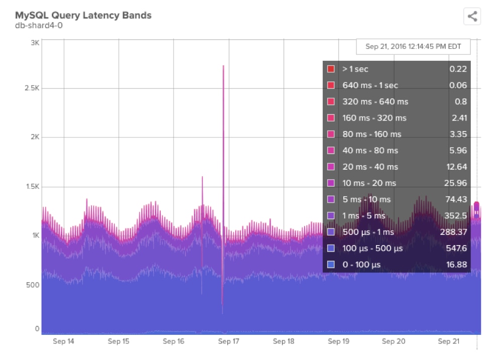
SolarWinds® Database Performance Monitor (DPM) recently released our Query Latency Bands chart, which combines both histograms and heat maps. Here’s what they look like: You’ll notice that we use colors instead of vertical positioning for different latencies. Because we have stacked area metrics, this method proves to be a lot more detailed since you can see exactly how many elements went into each band. Glance up at the chart again: the combination of the chart with the color-coded key should make it easy to spot exactly where transitions between elements take place and to count how many elements contribute at each point on the x-axis.
Similarly, a color choice can make activity spikes jump out in a visceral way; note the big needles of color in the Sep 16 - Sep 17 timerange. The pinker hue digs deep into the purple and blue. Picking useful colors is especially important in this case, because interpreting this activity would be too confusing otherwise.
Likewise, having random colors would make it difficult to interpret the chart quickly. Once you figure out an effective, deliberate color spectrum, the colors become really helpful! For instance, we picked those colors to make it easy to pick out servers that have high latencies. Red areas are easy to spot! This is especially the case when you’re looking at a huge grid of these charts.
 Even beyond the ease and efficacy of good color choices, we’ve found that it can be deeply satisfying to identify a color scheme that just looks good. When your database workload is churning out charts and producing wave after mesmerizing wave of visualizations, pairing that visual feedback with a color set that you find both easy to interpret and easy on the eye can generate a new satisfaction: turning your database workload into a piece of art.


