This post is part of an ongoing series on the best practices for effective and insightful database monitoring. Much of what's covered in these posts is unintuitive, yet vital to understand. Previous posts have covered Why Percentiles Don't Work the Way You Think; how to avoid getting to a point When It's Too Late to Monitor; how to tell If a Query Is Bad; and Why You Should Almost Never Alert on Thresholds.
Excel makes it easy to add a “trendline” to a chart, but does the trendline actually reflect the processes that produced the data? Usually not. Usually a trendline is just
chartjunk and you shouldn’t use it.
Here’s an example of a trendline on a chart. This one comes from an Excel file provided with an OECD dataset on health statistics (
source,
data).
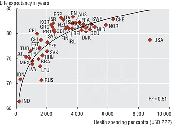
Whoever created the scatterplot chart of health spending per capita versus life expectancy at birth is asserting, probably unintentionally, that the relationship is logarithmic. That is, as a country spends more on healthcare per capita, the return on investment in lifespan grows logarithmically.
Is the addition of a trendline really a claim that the data follows the model that generates the trendline? Yes, it really is, although most people don’t think of it that way. Trendlines are used to explain datasets and to forecast how they’ll behave beyond the observable limits. Even the Excel help articles on trendlines are explicit about this; they are titled “
Predictdata trends” and include references to projections, e.g. “a trendline is used to depict trends in your existing data or forecasts of future data.”
Excel permits only a few kinds of trendlines, and the only type that matches the curve shown in the above chart is the logarithmic one,
y=c ln(x) + b.
Although most people probably use trendlines without intending to assert that the data follows the trendline’s model, there’s really no point to adding a trendline otherwise. And in datasets such as the one shown, there’s no way to know that lifespan is a logarithmic function of spending. This is chartjunk, pure and simple.
In other words,
if you don’t think the data is logarithmic, don’t fit a logarithmic curve to it.
The logarithmic curve is also a very poor prediction of the data, with the R-squared value of 51%. That’s very low, so low that it’s not worth showing. What is the purpose of adding a trendline with such a poor fit? What was the person thinking who created this chart? I’d guess they were not very experienced in statistics.
I see arbitrary trendlines fit to datasets all the time, whether they’re appropriate or not. I have
mocked this practice several times before.
In fact, if I’m going to fit any data to this curve, I think it looks more like the USL shifted vertically than anything else:

My eye is trained to see the USL everywhere at this point, whether it’s real or not (all meaning has pattern, not all pattern has meaning). Let’s see how well that fits and if it’s a better predictor. Here’s a plot:

The R-squared value is now 99.83%. That’s much better! This must mean the USL is the correct model to predict lifespan as a function of healthcare spending, right? Given that it’s a model of
system scalability, that’s an odd result.
Notice something? The original plot from the OECD actually hides some of the data! Those sneaky people! They changed the axis range to hide South Africa. Look, if I change the vertical axis range, a new outlier appears.
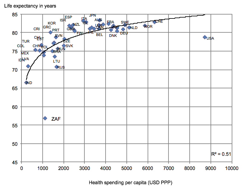
This might be of interest to the hundreds of people who retweeted, quoted, and replied to Conrad Hackett, a demographer who
tweeted about this chart a few weeks ago. Whoops. He apparently thought America is the only notable outlier because someone lied to him with chart axes and a logarithmic curve.
But hey, while we’re fitting arbitrary curves to things, why not try to fit the USL to the
path of the moon as it moves through the sky during an eclipse? That looks kind of USL-ish, too.
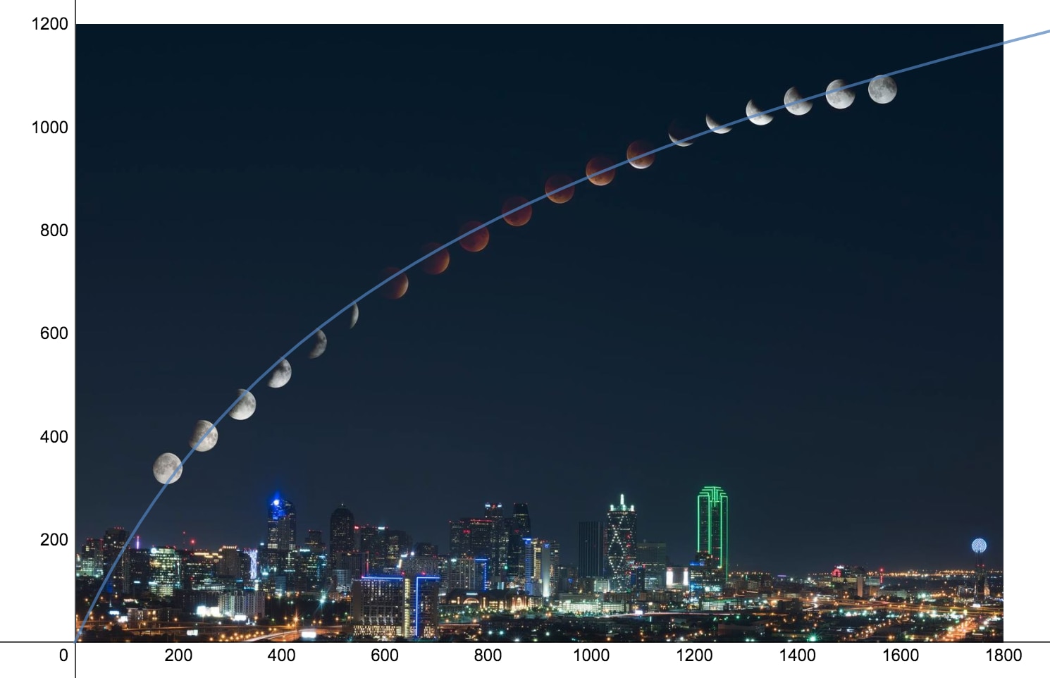
Turns out the R-squared fit of the USL to the path of the moon is 99.97% so that seems to be a great fit, too. Wow! I wonder what else the USL can predict?
Or maybe I should have fit a logarithmic curve to the moon? How can I know that I’m using the right curve? What a dilemma! Maybe, as I mentioned in my recent
book on the Universal Scalability Law, I should just buy a French Curve set and draw any curves that seem to fit?
What’s the moral of the story?
- Charts lie. Check the axes and the data.
- Trendlines are almost always chartjunk. Don’t do chartjunk.
- A trendline is an assertion that the data is the result of a model, whether you want it to be or not.
- Don’t just fit lines through things. You can find an equation that’ll fit just about any set of points, but that doesn’t mean there’s a relationship.
 Whoever created the scatterplot chart of health spending per capita versus life expectancy at birth is asserting, probably unintentionally, that the relationship is logarithmic. That is, as a country spends more on healthcare per capita, the return on investment in lifespan grows logarithmically.
Is the addition of a trendline really a claim that the data follows the model that generates the trendline? Yes, it really is, although most people don’t think of it that way. Trendlines are used to explain datasets and to forecast how they’ll behave beyond the observable limits. Even the Excel help articles on trendlines are explicit about this; they are titled “Predictdata trends” and include references to projections, e.g. “a trendline is used to depict trends in your existing data or forecasts of future data.”
Excel permits only a few kinds of trendlines, and the only type that matches the curve shown in the above chart is the logarithmic one, y=c ln(x) + b.
Although most people probably use trendlines without intending to assert that the data follows the trendline’s model, there’s really no point to adding a trendline otherwise. And in datasets such as the one shown, there’s no way to know that lifespan is a logarithmic function of spending. This is chartjunk, pure and simple.
In other words, if you don’t think the data is logarithmic, don’t fit a logarithmic curve to it.
The logarithmic curve is also a very poor prediction of the data, with the R-squared value of 51%. That’s very low, so low that it’s not worth showing. What is the purpose of adding a trendline with such a poor fit? What was the person thinking who created this chart? I’d guess they were not very experienced in statistics.
I see arbitrary trendlines fit to datasets all the time, whether they’re appropriate or not. I have mocked this practice several times before.
In fact, if I’m going to fit any data to this curve, I think it looks more like the USL shifted vertically than anything else:
 My eye is trained to see the USL everywhere at this point, whether it’s real or not (all meaning has pattern, not all pattern has meaning). Let’s see how well that fits and if it’s a better predictor. Here’s a plot:
 The R-squared value is now 99.83%. That’s much better! This must mean the USL is the correct model to predict lifespan as a function of healthcare spending, right? Given that it’s a model of system scalability, that’s an odd result.
Notice something? The original plot from the OECD actually hides some of the data! Those sneaky people! They changed the axis range to hide South Africa. Look, if I change the vertical axis range, a new outlier appears.
 This might be of interest to the hundreds of people who retweeted, quoted, and replied to Conrad Hackett, a demographer who tweeted about this chart a few weeks ago. Whoops. He apparently thought America is the only notable outlier because someone lied to him with chart axes and a logarithmic curve.
But hey, while we’re fitting arbitrary curves to things, why not try to fit the USL to the path of the moon as it moves through the sky during an eclipse? That looks kind of USL-ish, too.
 Turns out the R-squared fit of the USL to the path of the moon is 99.97% so that seems to be a great fit, too. Wow! I wonder what else the USL can predict?
Or maybe I should have fit a logarithmic curve to the moon? How can I know that I’m using the right curve? What a dilemma! Maybe, as I mentioned in my recent book on the Universal Scalability Law, I should just buy a French Curve set and draw any curves that seem to fit?
What’s the moral of the story?


