As SolarWinds creative director, I’m proud to lead our Brand, Design, and Video teams. During my 10 years here as a Solarian, I’ve been through a number of product launches and company updates. And right now, with momentum around new products like SolarWinds Observability, new initiatives, and now this next chapter in the best story in software, I wanted to share it with all of you—here’s a video that sums it up:
Our goals with the brand refresh we announced today were to modernize our look and bring new energy to SolarWinds. As we kicked off our exploration, we knew we wanted to keep the core identity we’ve built over the last two decades—while focusing on the future and pushing things forward.
Let’s start with our logo.
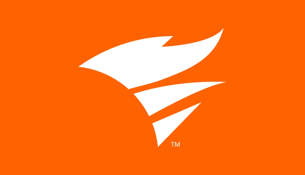
![]() The first thing you’ll notice is our flame has moved to the front of our SolarWinds logo. That’s because it’s our torch and guiding light. Our flame is iconic, IT professionals recognize it well, and it’s a core component of our SolarWinds brand. We’ll continue to feature the flame in our updated logo and use it as a standalone icon.
The first thing you’ll notice is our flame has moved to the front of our SolarWinds logo. That’s because it’s our torch and guiding light. Our flame is iconic, IT professionals recognize it well, and it’s a core component of our SolarWinds brand. We’ll continue to feature the flame in our updated logo and use it as a standalone icon.
Next, you’ll notice we’re using a new shade of orange. It is bright, bold, and ignited. This vibrant shade of orange—together with an entirely new brand color palette—was specifically chosen to meet web accessibility requirements while also turning up the volume of our energy.
We’ve made other changes you’ll start to notice in how we use photography, copy, and motion. It’s all about catching your attention, capturing a feeling, and helping you engage with our content. After all, we’ve spent nearly 25 years helping technology professionals and business leaders solve their toughest problems, and we’re excited to keep doing so.