If you work with monitoring or monitoring tools much, you’ve probably seen the phrase “correlating” here and there. For example, monitoring vendors often say you can use their product to correlate metrics. Issue 157 in the popular Prometheus monitoring system’s GitHub repository is to add support to correlate multiple metrics in the same graph.
I’ve noticed that when monitoring-related discussions mention correlation, the meaning is usually pretty vague. It often seems to refer to just graphing multiple things on a single chart with the same timescale.
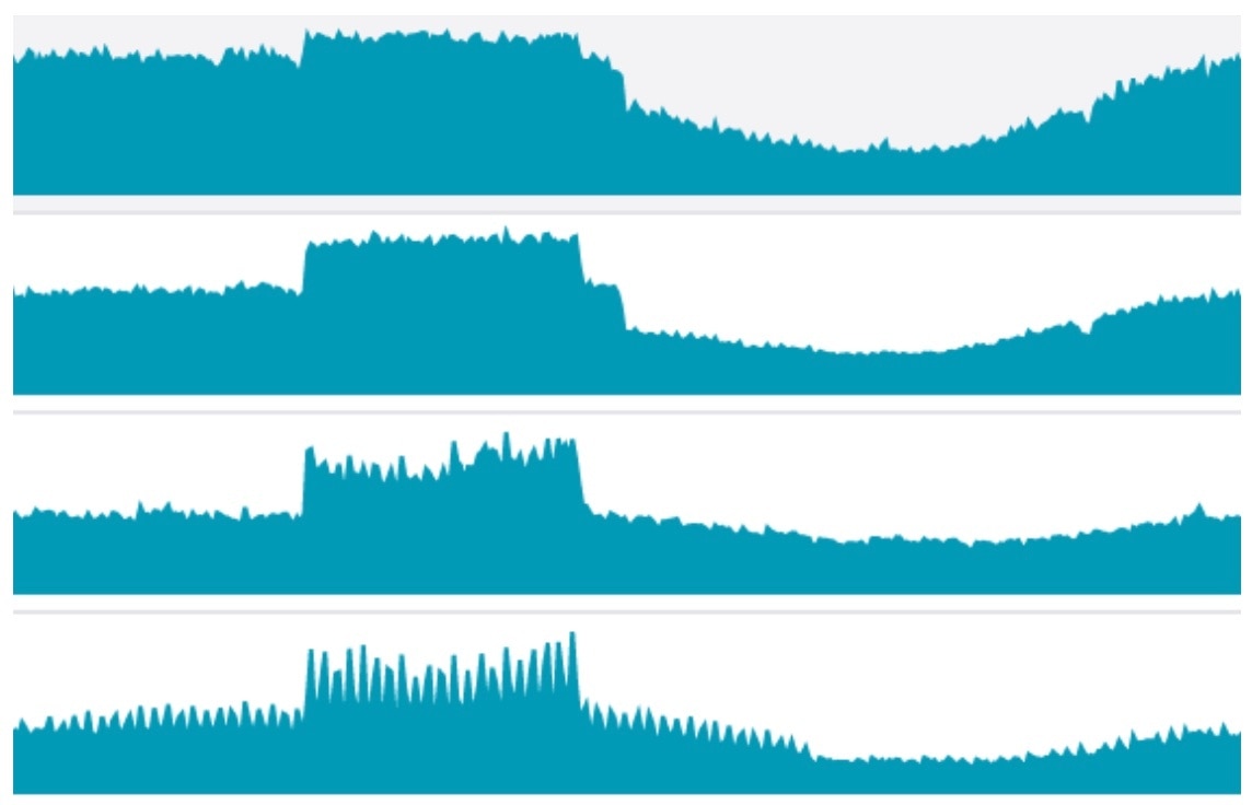
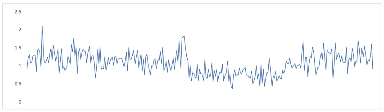
Here’s an example of metrics that seem to be correlated:
 But visually aligning metrics isn’t the same thing as correlation. Correlation has a specific meaning, and I think we do ourselves injustice when we get in the habit of blurring that meaning; we lose the real benefits of correlation, we tend to think as imprecisely as we speak, and we teach ourselves and others that clarity and rigor aren’t valuable. So I think it’s important to know what correlation really is.
And although our eyes are powerful signal processors, and these charts aren’t a bad thing per se, there are many other ways to visualize multiple metrics that provide a lot more insight than just plotting them together.
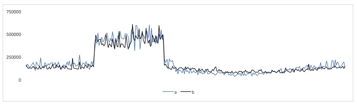
In this post I’ll show some correlated metrics and a few different ways to think about them. To begin, here are two of the above metrics, plotted together on a single chart with the same axes:
But visually aligning metrics isn’t the same thing as correlation. Correlation has a specific meaning, and I think we do ourselves injustice when we get in the habit of blurring that meaning; we lose the real benefits of correlation, we tend to think as imprecisely as we speak, and we teach ourselves and others that clarity and rigor aren’t valuable. So I think it’s important to know what correlation really is.
And although our eyes are powerful signal processors, and these charts aren’t a bad thing per se, there are many other ways to visualize multiple metrics that provide a lot more insight than just plotting them together.
In this post I’ll show some correlated metrics and a few different ways to think about them. To begin, here are two of the above metrics, plotted together on a single chart with the same axes:
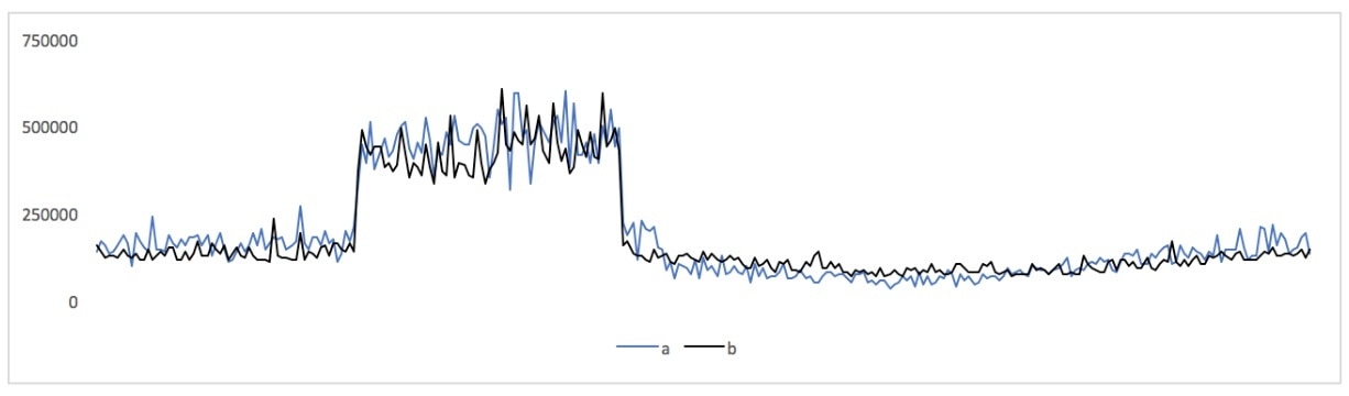 Those are latency metrics of individual types of queries to database servers: one MySQL server and one PostgreSQL server (the use case is beyond the scope of this blog post, but it's someone evaluating switching technologies, which SolarWinds® Database Performance Monitor (DPM) is uniquely capable of helping with because we support monitoring query performance at a very granular level across hybrid data tiers, in a unified way).
In the common parlance of monitoring, we would definitely say those metrics are correlated! But how correlated, exactly?
Those are latency metrics of individual types of queries to database servers: one MySQL server and one PostgreSQL server (the use case is beyond the scope of this blog post, but it's someone evaluating switching technologies, which SolarWinds® Database Performance Monitor (DPM) is uniquely capable of helping with because we support monitoring query performance at a very granular level across hybrid data tiers, in a unified way).
In the common parlance of monitoring, we would definitely say those metrics are correlated! But how correlated, exactly?
Correlation as a Noun
For decades, correlation has been a noun: the idea that different things are related, and a measure of how closely. In statistics, specifically, correlation is an inferred interdependence between variables. There’s an equation to quantify how related two metrics are. Most of us don’t need to know the math, but you can look on Wikipedia, or in the documentation for the Excel CORREL() function.
If you put those metrics into a spreadsheet and use the CORREL() function on them, their correlation coefficient is 0.946744126, which is strong correlation; a coefficient of 1 is perfect.
The trouble with the correlation coefficient is it reduces everything to a number, which is hard to interpret. What “shape” is the correlation between the metrics? Are there outlying points? Those types of distinctions are all aggregated away, and all that remains is 0.946744126.
This problem is well-known in statistics, and there’s a dataset called Anscombe’s Quartet that illustrates it nicely. Four very different datasets have the same summary statistics (mean, regression lines, correlation between X and Y values, etc). These are invisible in the statistical measures, but the graphs are dramatically different.
Visual Correlation With Scatterplots
A scatterplot is another way to examine how points are correlated. Take each pair of time series data points at each moment, discard the time dimension, and plot the values against each other on a scatterplot. Now you can see a completely different view of the relationship between the metrics.
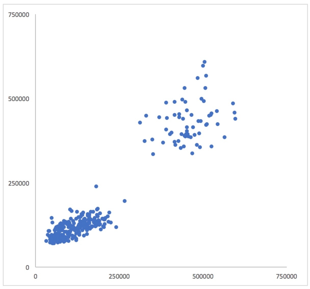 If the metrics were perfectly correlated, all of the points would lie on a straight line extending from the origin. The more the cloud of points appears to “point at the origin,” the more correlated the two datasets are. To help reduce the effect of optical illusions that may be present in the datasets, you can also add a regression line and set the intercept to 0. I’m using Excel, so I also selected the option to add the slope and R-squared values to the chart:
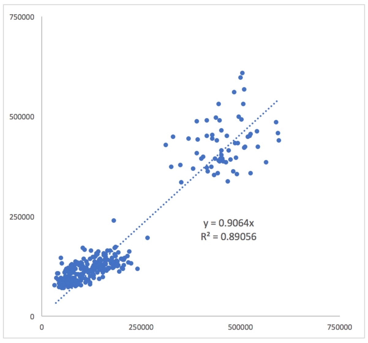 Now you can see that the cloud of smaller values (those closer to the bottom left) actually appears to have a different slope than the diagonal line. What this means is that the points that aren’t in the “hump” of the metrics aren’t as correlated as they might appear!
Divide the Metrics
The scatterplots are great, but unfortunately they discard the time dimension. You can add in additional decorations to try to retain some sense of where the points lie on the time axis, such as color-coding the points by time, but this doesn’t always work very well. It can become messy and hard to understand.
Instead of discarding the time dimension to visualize the metrics’ relationship to one another, you can discard the metrics’ values and retain their timestamps. You can do this by dividing one metric by the other. Now you have a derived metric. If the metrics are perfectly correlated, this derived metric’s value will be constant. Here’s how that looks:
 What this points out is that during a region of time after the “hump” is past and the metrics return to normal again, these metrics have a kind of pendulum relationship: one is larger than the other, then they trade places. This occurs in the second half of the chart, when the derived metric is typically a bit below zero, then it climbs a bit above zero. If you look at the original metrics you can see that happening:
 You might not have noticed that if you hadn’t plotted these variables in so many different ways. By the way, this is the same thing that shows up in the scatterplot, when the slope of the lower-left cloud of points appears different than the slope of the regression line.
One advantage of a derived metric, instead of a scatterplot or other ways to examine correlation, is that it fits into time series charting tools. If all you have is a charting tool that can draw strip charts, you might as well use it to the fullest.
You might not have noticed that if you hadn’t plotted these variables in so many different ways. By the way, this is the same thing that shows up in the scatterplot, when the slope of the lower-left cloud of points appears different than the slope of the regression line.
One advantage of a derived metric, instead of a scatterplot or other ways to examine correlation, is that it fits into time series charting tools. If all you have is a charting tool that can draw strip charts, you might as well use it to the fullest.
Conclusion
The relationships between measured effects in our systems are important. They can shed light on what’s happening in the systems. I have deliberately kept this article abstract, but you can easily see lots of ways this can happen in your systems: as traffic increases, so does CPU utilization; as load increases, so does the number of open filehandles; and so on. But when are there nonlinearities, or changes in the nature and characteristics of the relationships between these metrics?
Correlation can help find that. Visually lining up charts so you can say, “When this happens, so does that,” is a first step, but it’s much more powerful to be able to say, “When this happens, so does that, in direct proportion, until 120 connections, and then it gets nonlinear really quickly.” Statistical measures like the correlation coefficient can help quantify these types of things to some degree, but it’s always helpful to visualize what’s happening. And the traditional time series chart is far from the most powerful or useful visualization!